JCPENNEY–FALL CAMPAIGN
How do we capture new audiences while getting a loyal, value-driven customer to shop one more time?
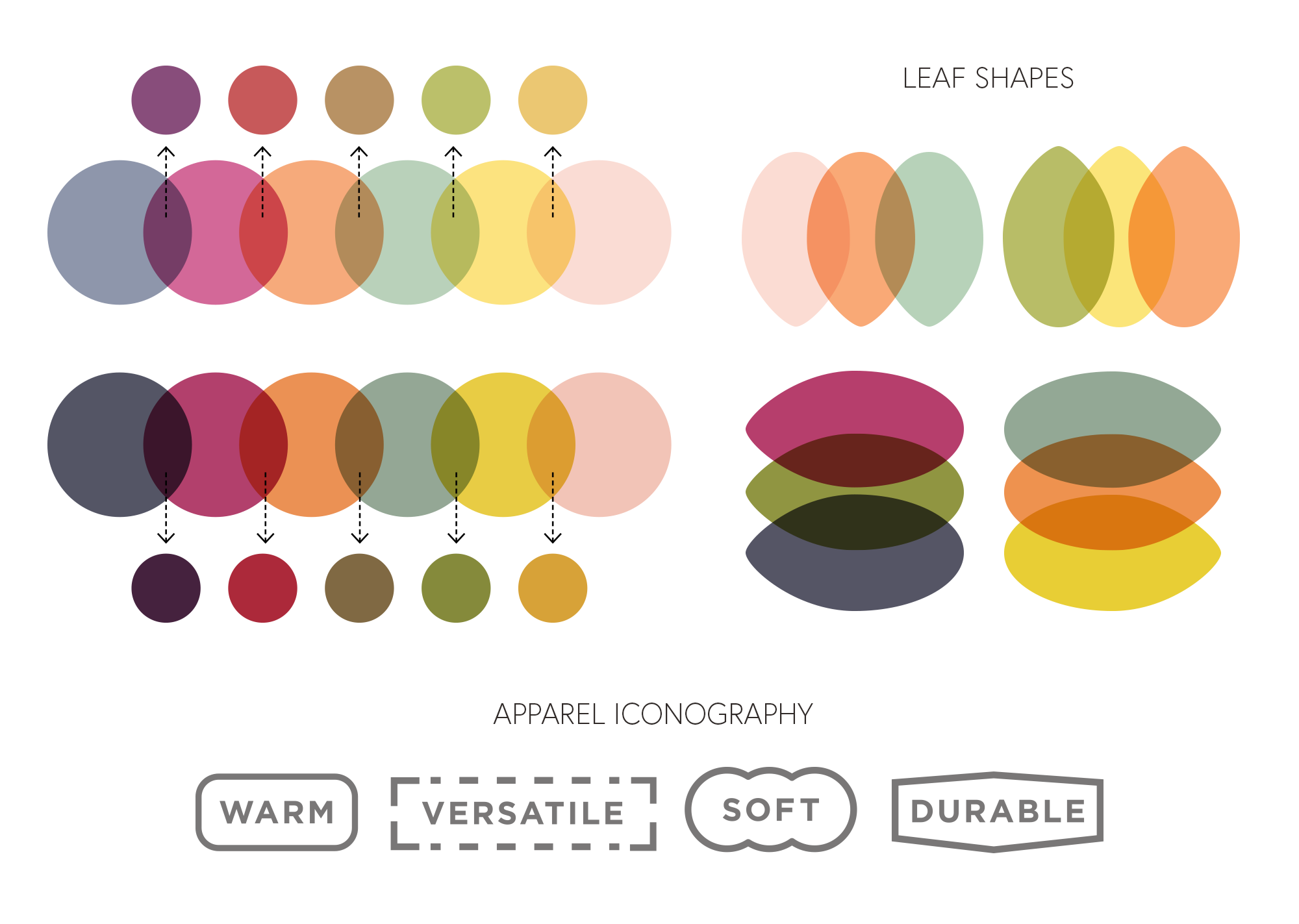
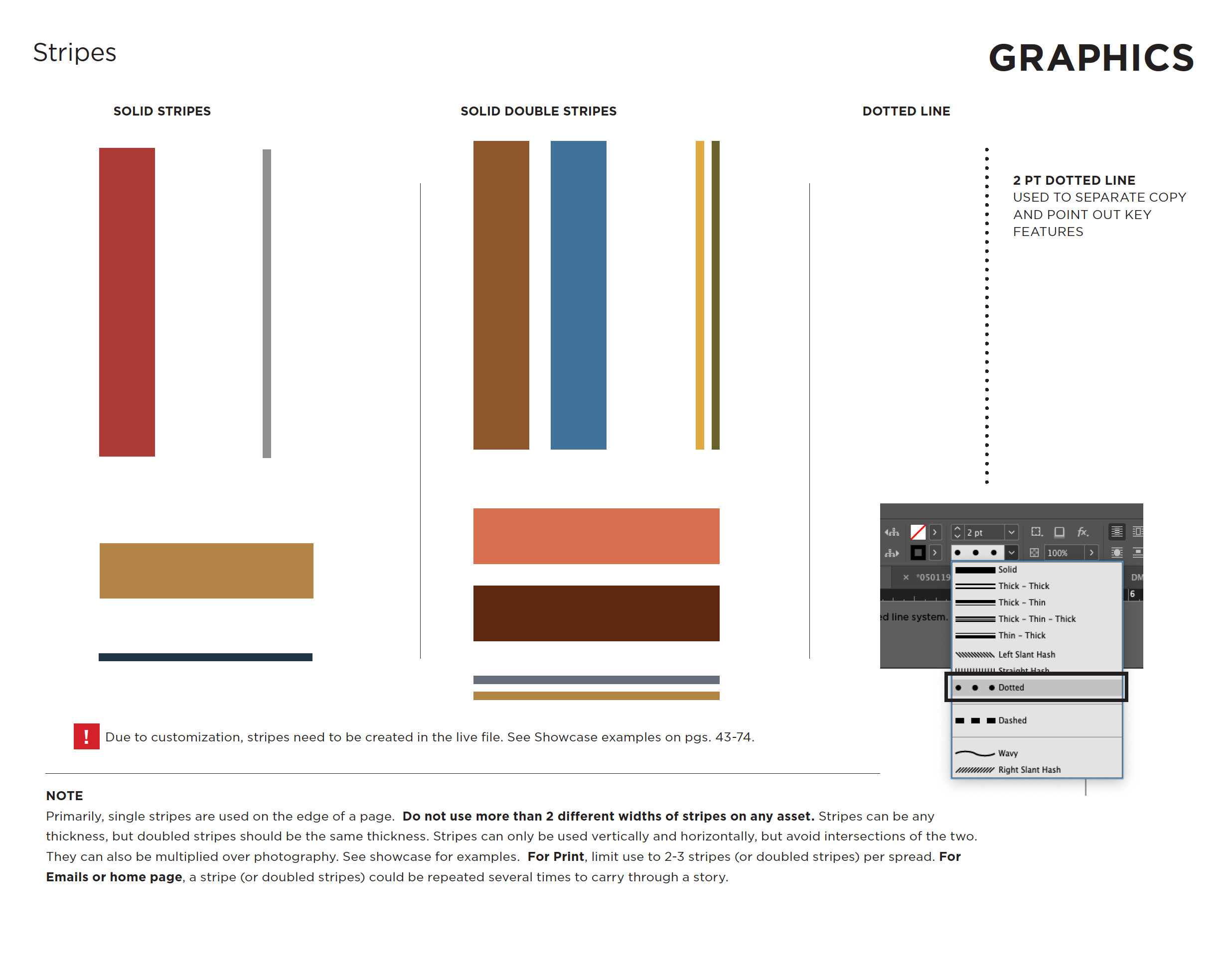
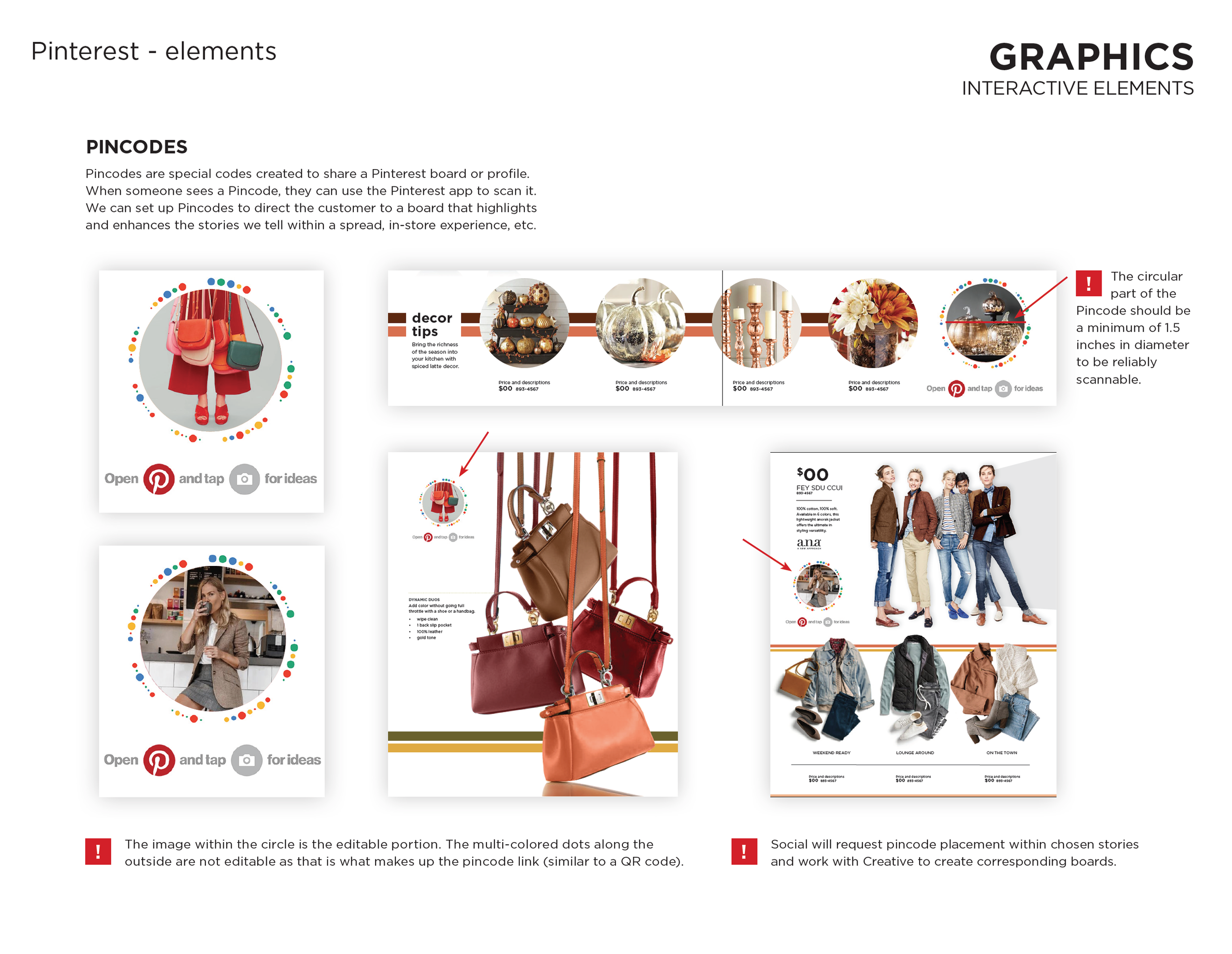
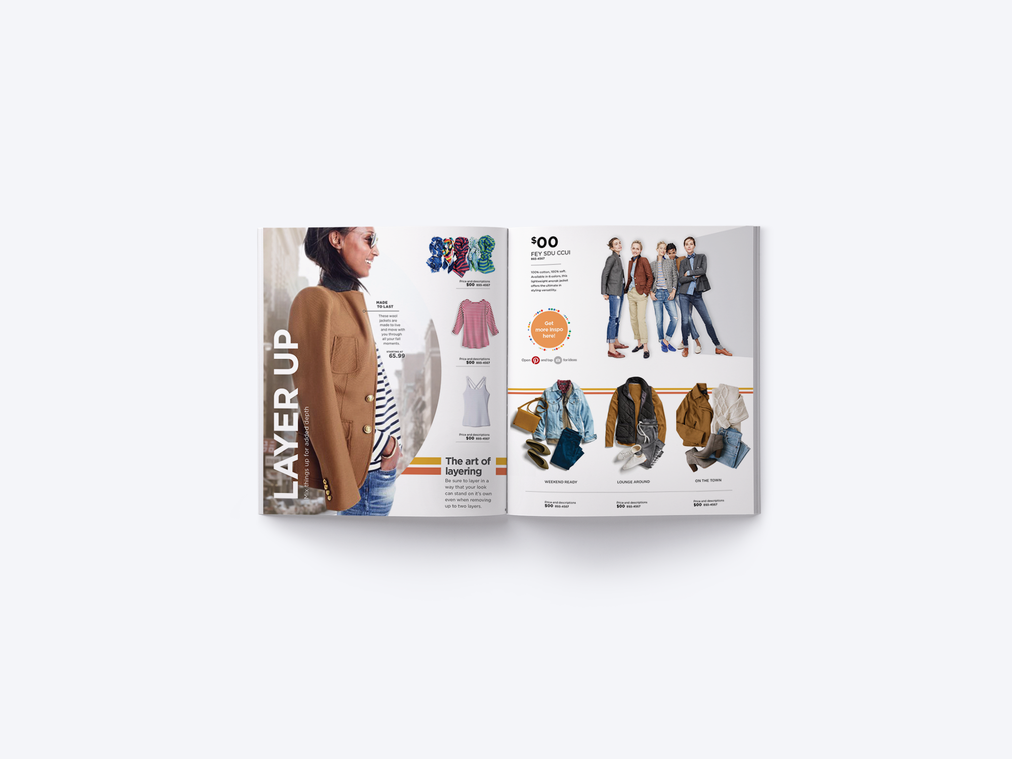
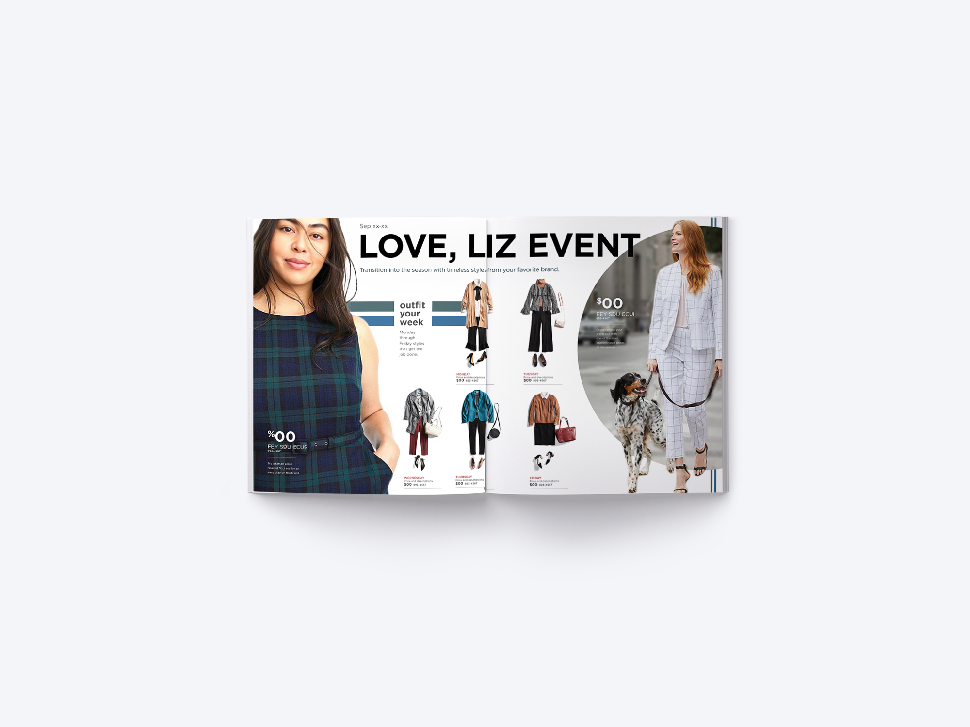
Testing showed customers connected most with diverse casting and authentic group moments. I swiped photography that had genuine, expressive moments, created vibrant but sophisticated color palettes, and designed the layout that became the anchor template for the campaign. I also created an iconography system to signal quality and attributes, giving value-driven customers a fast scan of product qualities.
ROLES
Concepting, Design, Photo Direction
PLATFORMS
Print, Social & Web
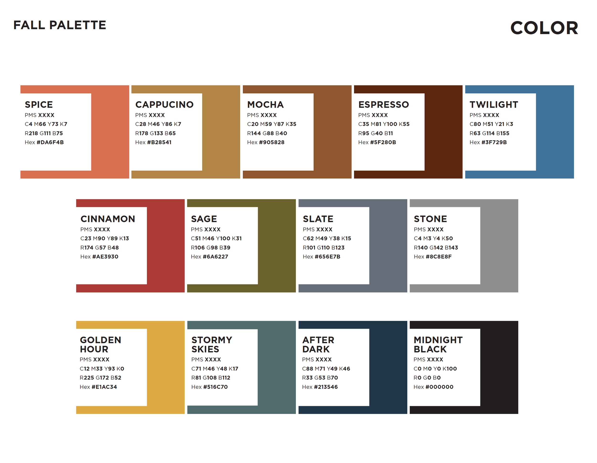
I built the color palette by making sure the color complemented our fall lineup in all our categories and still pushed the boundaries of what was “expected” for a fall palette.
Ultimately, two teams collaborated to refine all our concepts with a more conservative color palette and a minimal graphic approach.
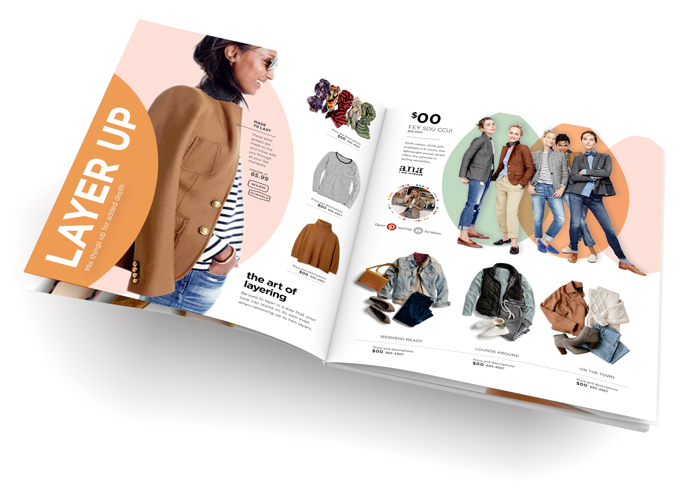
Final executions below.
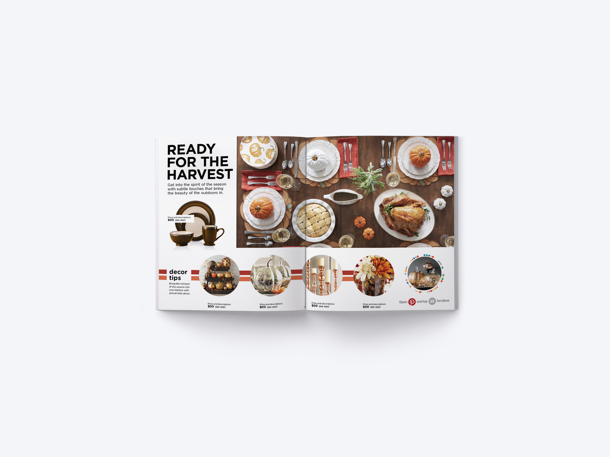
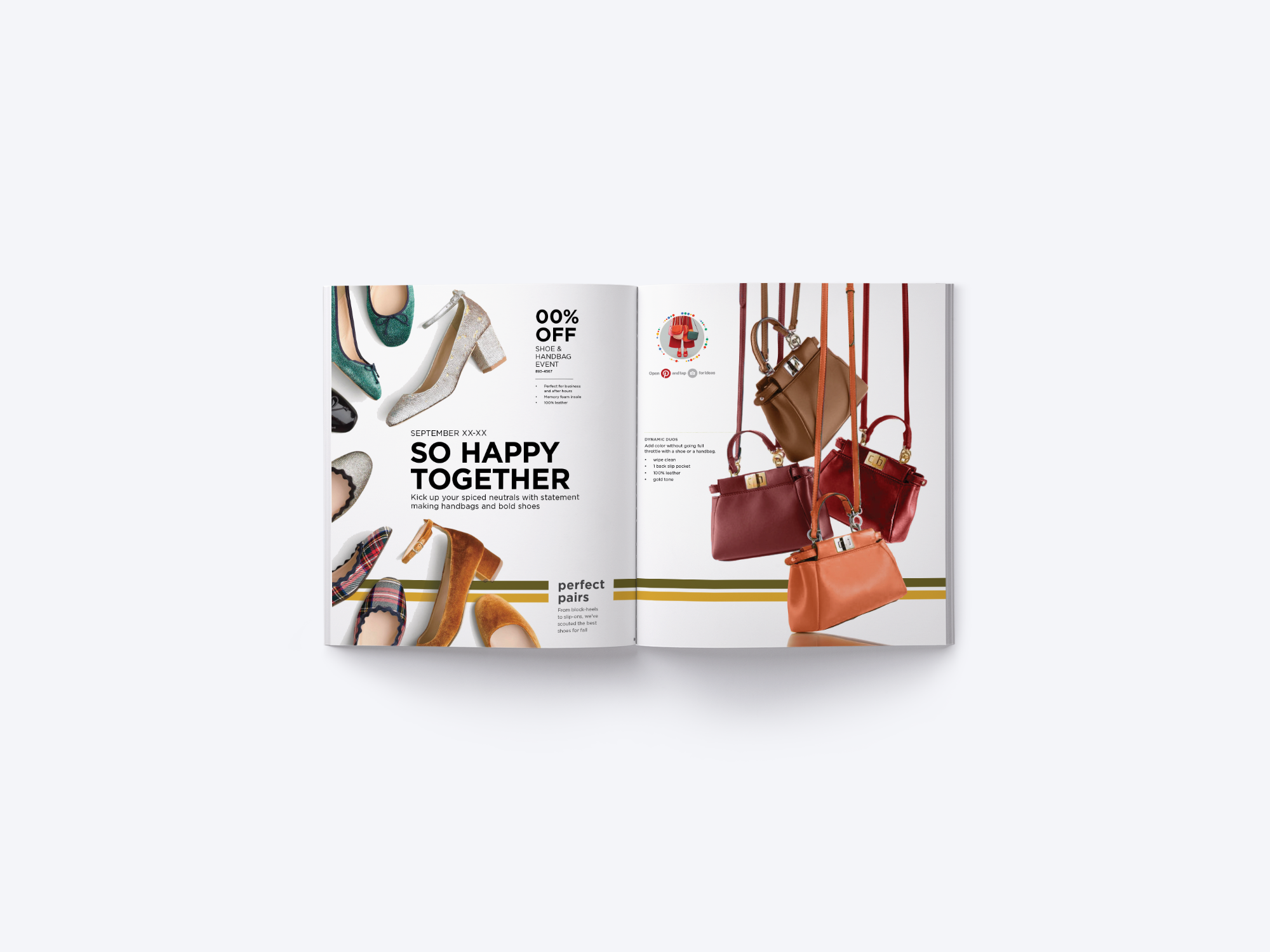
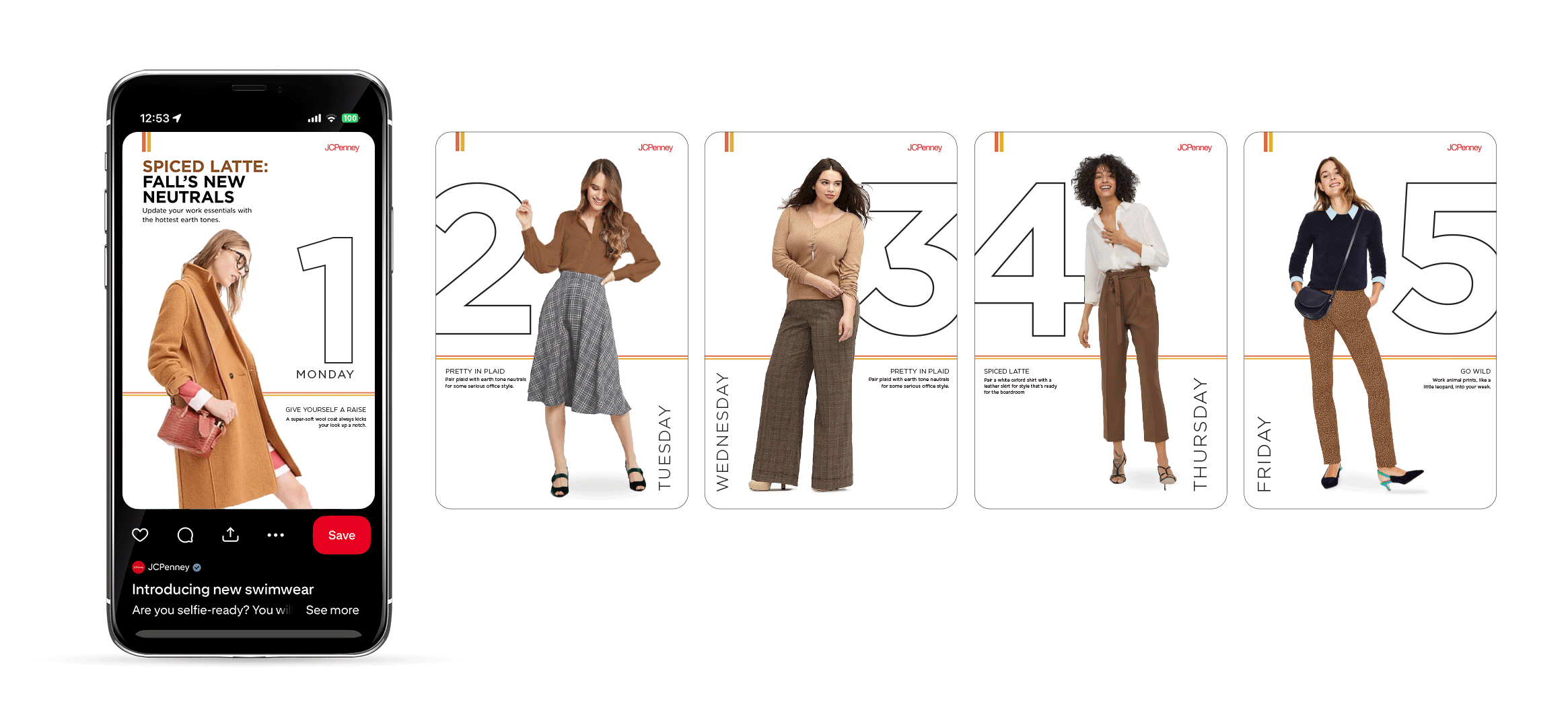
Spiced Latte Theme – Pinterest Work Outfit Inspo